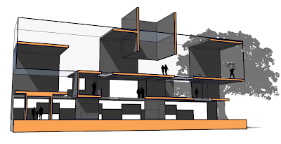
Section Perspective
I scaled the tree down a bit and darkened the section color
Sunday, April 29, 2007
Friday, April 27, 2007
Sunday, April 22, 2007
Section Perspective
I finally figured it out...

For some reason sketch up would not let me export my file as a DWG so i was unable to put it into illustrator. Until i figure out how to fix it, here is the section that i would have rendered
Posted by
Daniele Cohen
at
11:10 PM
0
comments
![]()
Assignment #3
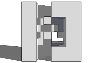
The aim of this exercise was to develop one of our previous schemes to create a "continuity of space." We were required to give each of the cubes six inch thick walls and 12 inch thick floors, and were then allowed to extend those floors and walls the length of the cube (though we were restricted to two "moves" or extentions per cube).
Eye-Level Perspective
Posted by
Daniele Cohen
at
9:38 PM
0
comments
![]()
Posted by
Daniele Cohen
at
9:34 PM
0
comments
![]()
Tuesday, April 17, 2007
Assignment #2
The object of this assignment was to create three schemes; one centralized, one decentralized, and the final one a combination of the two former schemes (a hybrid), with a specific kit of parts. My first try (the decentralized scheme) focused mainly on the boxes themslves (the solids) rather than the space created by them (the void). This wasn't a problem because the solids, and thus the voids, were arranged to create a homogenous composition (one with no particular focus). In the following schemes however, I had to focus much more on the void to get the desired effect.
Posted by
Daniele Cohen
at
1:10 AM
0
comments
![]()
Monday, April 16, 2007
Saturday, April 7, 2007
Subtractive Approach
Isometric: This view gives a good sense of where the voids are within the cube in relation to each other. The focus is primarily on the vertical void with one end of the horizontal void in the background
2nd Isometric: A better view of the horizontal void
Perspective Elevation: You can clearly see the vertical void, as well as the secondary smaller horizontal void which runs through both the vertical and principle horizontal voids 
Perspective Elevation: Looking at the opposite side the horizontal voids dominate
Immersive Perspective: Standing inside the main horizontal void 
Immersive Perspective: Standing at the bottom of the vertical void looking up 
Posted by
Daniele Cohen
at
7:16 PM
0
comments
![]()
Additive Approach
In this exercise I tried to create circular and spiraling voids using square and rectangular blocks.
Isometric: The vertical void is hard to make out at first from this perspective, but it's in the forground with one of the openings to the horizontal void to it's right 
Perspective Elevation: This view clearly shows the horizontal void
Perspective Elevation, Top View: Looking down through the vertical void
Immersive Perspective: Inside the horizontal void looking out 
Immersive Perspective: At the top of the vertical void looking down 
Posted by
Daniele Cohen
at
7:14 PM
0
comments
![]()


